Paid media gets people to your page. The page decides whether you paid for a customer or a bounce. Improving landing page conversion is often the cheapest way to lower acquisition costs, because every improvement multiplies the return on every click you already buy. Here are twelve tactics we apply to paid-traffic landing pages, ordered roughly from the quickest wins to the more involved work, with practical steps for each.
Key takeaways
- Message match between ad and landing page is the first thing to fix and often the biggest lever.
- One page, one goal, one primary call to action. Every extra choice dilutes attention.
- Shorter forms are not automatically better; ask only for what you need, and qualify where it helps sales.
- Speed and mobile usability are conversion factors, not just technical chores. Track LCP, INP and CLS.
- A/B tests need a pre-calculated sample size and a fixed duration. Peeking and stopping early produces false winners.
Tactics 1–3: Message match, above the fold and one CTA
1. Match the message to the ad and the search
Message match means the landing page continues the conversation the ad started. If the ad says “Same-day AC repair in Albuquerque,” the headline should say essentially the same thing, not “Welcome to our company.” When visitors do not immediately see what they clicked for, many leave.
- Mirror the ad’s main promise and key terms in the headline.
- Carry the same offer, price or incentive through to the page.
- Build separate pages, or dynamic headline sections, for distinct ad groups and audiences rather than sending all traffic to the homepage.
- Keep visual continuity with social ads: similar imagery, colors and product shots.
Message match also helps on the ad side: Google Ads evaluates landing page experience and relevance as part of Quality Score. See our guide on improving Quality Score to lower CPC.
2. Make the first screen do the heavy lifting
The first screen a visitor sees, especially on mobile, must answer three questions in seconds: What is this? Is it for me? What do I do next?
- Headline: the outcome or offer in plain language.
- Subheadline: who it is for and the main differentiator.
- Visual: the product, the result or a person using it, not a generic stock image.
- Primary CTA: visible without scrolling.
- A trust signal: a real review rating, a recognizable certification or a guarantee.
3. Use a single, specific call to action
Dedicated landing pages work best with one conversion goal. Remove or minimize site navigation, avoid competing offers and repeat the same CTA at logical points down the page. Make the button text describe the result (“Get my free quote,” “Start my trial”) rather than a generic “Submit.” If you need a secondary option, such as calling instead of filling in a form, make it visually subordinate.
Tactics 4–5: Forms and real social proof
4. Optimize the form
Forms are where intent becomes action, and where many pages lose it.
- Audit every field. For each one, ask whether sales or fulfillment actually uses it. Remove the ones they do not.
- Balance volume and quality. Cutting fields can raise submissions but lower lead quality. If your sales team drowns in unqualified leads, a qualifying question (budget range, timeline, service type) can improve cost per qualified lead even if raw conversion rate falls.
- Use multi-step forms for longer asks. Start with easy questions, then collect contact details. Show progress.
- Help the browser help the user. Use correct input types (email, tel), autocomplete attributes and clear labels above fields, not placeholder text that disappears.
- Write helpful errors. Validate inline, explain what is wrong and keep what the user already typed.
- Reassure at the point of action. A short line about what happens next and how you use their data reduces hesitation.
5. Show social proof, and only real social proof
People look for evidence that others like them have chosen you and were happy. Effective proof includes verified reviews, named testimonials with permission, case-study results, client logos you are authorized to show, ratings from independent review platforms and recognized certifications.
Watch out: Never fabricate reviews, testimonials, counts or “as seen in” logos. Beyond damaging trust, it carries legal risk: the FTC’s rule on consumer reviews and testimonials, which took effect in 2024, prohibits fake reviews and certain review-suppression practices. Review the FTC’s advertising guidance before publishing endorsements.
Place proof near the decision points: next to the CTA, beside the form and after the section that handles the biggest objection. Specific proof (“Installed in two days, crew cleaned up everything”) persuades more than vague praise (“Great service!”).
Tactics 6–7: Speed, Core Web Vitals and mobile
6. Make the page fast and stable
Paid clicks often come from mobile devices on variable connections. Every second of loading is a chance for the visitor to give up before seeing your offer. Google’s Core Web Vitals give you three practical measures of real user experience:
| Metric | What it measures | “Good” threshold | Common fixes |
|---|---|---|---|
| Largest Contentful Paint (LCP) | How quickly the main content loads | 2.5 seconds or less | Compress and properly size hero images, preload the hero, reduce render-blocking scripts, use a CDN |
| Interaction to Next Paint (INP) | How quickly the page responds to taps, clicks and typing | 200 milliseconds or less | Cut heavy JavaScript, defer non-essential tags, break up long tasks |
| Cumulative Layout Shift (CLS) | How much content jumps around while loading | 0.1 or less | Set image and embed dimensions, reserve space for banners, avoid late-injected content above the fold |
INP replaced First Input Delay as a Core Web Vital in March 2024. Google assesses these at the 75th percentile of real page loads, so check field data in PageSpeed Insights or Search Console, not just a single lab test. The Core Web Vitals documentation explains the methodology. A frequent culprit on marketing pages is tag bloat: years of tracking pixels, chat widgets and heatmap scripts added and never removed. Audit them.
7. Design for mobile first
- Test on real phones, not just a resized desktop browser.
- Keep the headline and CTA within the first mobile screen.
- Use tap targets large enough for thumbs, with space between them.
- Add click-to-call for service businesses whose customers prefer to phone.
- Avoid pop-ups that cover content on mobile; Google may treat intrusive interstitials as a poor experience, and users certainly do.
- Shorten copy blocks and use clear subheadings so people can scan.
Tactics 8–9: Handle objections and reduce risk
8. Answer objections before they are raised
List the reasons a qualified visitor might not convert: price, uncertainty about results, time to implement, switching effort, trust. Pull them from sales calls, support tickets, reviews and on-page surveys. Then address each one on the page with a short section, an FAQ, a comparison or a proof point. The order matters: handle the most common objection first.
9. Reverse the risk
Guarantees, free trials, no-contract terms, free returns and transparent pricing all lower the perceived cost of saying yes. Only promise what you can deliver, state terms clearly, and place the risk reversal close to the CTA where hesitation peaks.
Tactic 10: Run A/B tests the right way
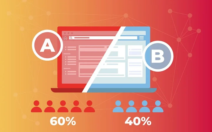
A/B testing is how you turn opinions into evidence. Done carelessly, it produces confident decisions based on noise.
A sound testing process
- Start with a research-backed hypothesis. “Because session recordings show mobile users scrolling past the form without engaging, moving a short form into the first screen will increase mobile lead submissions.”
- Choose one primary metric tied to business value, such as qualified leads or purchases, not just button clicks.
- Calculate the sample size before launch. Use a sample-size calculator with your baseline conversion rate, the minimum effect you care about detecting, and your significance and power settings.
- Fix the duration. Run for whole weeks to capture weekly patterns, and do not stop the moment the dashboard turns green.
- Split traffic cleanly and keep ad campaigns stable during the test so a budget change does not distort results.
- Analyze segments with care. Device or channel breakdowns can generate ideas, but small segments are noisy. Treat them as hypotheses for the next test.
- Document everything, including losing and inconclusive tests.
Pro tip: If your page does not get enough conversions to test small tweaks in a reasonable time, test bigger changes: a different offer, a completely restructured page or a new angle. Larger expected effects need smaller samples to detect. Google Ads also offers campaign experiments, which let you split ad traffic between two landing pages without a separate testing tool.
Note that Google Optimize was shut down in September 2023, so if your process still references it you will need another testing platform or an ad-platform experiment feature.
Tactic 11: Learn from heatmaps and session recordings
Analytics tells you what happened. Behavior tools help you understand why.
- Scroll maps show how far people get. If most visitors never reach your strongest proof, move it up.
- Click maps reveal clicks on non-clickable elements (people expect them to be links) and ignored CTAs.
- Session recordings show hesitation, rage clicks, form abandonment and confusion. Watch a set filtered by device and traffic source rather than random sessions.
- Form analytics identify the specific field where people quit.
- On-page polls ask a single question, such as “What’s stopping you from booking today?”, and often surface objections you had not considered.
Configure these tools to mask personal data in form fields, load them only after consent where required, and include them in your privacy disclosures. They also add script weight, so sample traffic rather than recording everything forever.
Tactic 12: Make the page accessible
An accessible landing page converts more of the people who reach it, because barriers that block users with disabilities usually frustrate everyone else too. It also reduces legal risk. Use the W3C’s Web Content Accessibility Guidelines (WCAG), currently version 2.2, as your reference.
Accessibility checklist for landing pages
| Check | Why it matters |
|---|---|
| Sufficient text and button color contrast | Readable in sunlight on phones and for users with low vision |
| Visible labels on every form field | Screen readers announce them; users do not forget what a field was for |
| Full keyboard navigation with visible focus | Users who cannot use a mouse can still complete the form |
| Meaningful alt text for informative images | Conveys the content to screen reader users |
| Error messages in text, not color alone | Color-blind users can see what went wrong |
| Captions on video | Many people watch with sound off; deaf and hard-of-hearing users need them |
| Logical heading structure | Helps assistive technology and scanning readers alike |
Putting the 12 tactics into a CRO program
Tactics are only useful when applied in the right order. A practical sequence for paid-traffic pages:
- Verify tracking. Confirm conversions fire correctly and match your CRM or order data. Our guide to GA4 attribution and server-side tracking covers setup.
- Fix the obvious. Message match, broken mobile layouts, slow load times and confusing forms rarely need a test to justify fixing.
- Research. Gather analytics, behavior data, surveys and sales feedback.
- Prioritize and test. Rank hypotheses by expected impact and effort, then test the top ones properly.
- Feed results back to media. Winning messages often make better ad copy, and better conversion data helps ad platform algorithms optimize.
If you would rather have specialists run this cycle, our Conversion Rate Optimization Program handles research, test design, build and analysis alongside your paid campaigns.
Get more customers from the clicks you already buy
Alluka LLC audits your landing pages, fixes the leaks and runs disciplined tests that lower your cost per acquisition. Let’s review your highest-spend pages together.
Landing page optimization is never finished, but it compounds. Each improvement raises the value of every future click, makes your campaigns more competitive in ad auctions and gives you sharper insight into what your customers actually care about.